|
Well, I haven't posted here in what, a year now? This thing hasn't been dead, I just haven't had things I'm interested in talking about. There were like 4 draft articles I had in the works (still have them, actually) but not one felt right to finish and publish for varying reasons. I may eventually release the WIPs and call it a day if there's interest. Oh, and I've been slowly accruing more responsibilities on Smogon, so that's a thing. However, I've been working on some stuff with The Cutting Room Floor, and with the scans finally finished, I'm able to cover them properly. 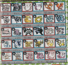 Fans of the first generation's history may recognize this sprite sheet. It's from the November 1996 issue of Corocoro Magazine. This was the first look players had at the title, which would be up for mail order in October of that year. I go over bits of it here. However, some of the sprites are not what you would see in the final release, implying there were some revisions before or after the press release provided to Corocoro. I'm leaning towards after. For a very long time, we didn't have very good scans of these, mostly relying on photographs from zoidsland. This wasn't a bad thing - it was better than nothing - but the quality was...not great.  So we have a collection of sprite scans that aren't of the best quality, to the point you can't even recreate them. How do you solve it when upscaling isn't really an option? Go out and buy the magazine yourself and scan it, of course! Well, erm, that's what I ended up doing on a whim. Why? Because seeing things like this ridiculously low-res Persian made me want to slash my eyes out, hahaha! Not all of them were like this, mind you, it was just...inconsistent. For the sake of clarity and because I don't want any random price increases, these magazines cost me almost nothing. The November 1996 issue cost me around £10 before postage, as did the December 1996 issue. Despite it taking a while for me to find someone with them, I do not believe these are actually rare in Japan considering the prices I saw them go for. The new scansWell, no more beating around the bush: you're here for the scans, yeah? For those wanting to see 1200 DPI scans of the sprites, you can use the following links to download them. The file size packs a punch of its own, so don't say I didn't warn you! I used an EPSON Stylus SX400 Printer-Scanner to do the deed, for those interested. It's nothing too extravagant, the printing part doesn't even work on it. But it scans japanese magazines from the 90s, which is all I need it for, eh? Anyway, here's a poorly-put-together compilation of the unique sprites for those who don't want to stare at those pages until their eyes melt out of their sockets. It's in JPG format so the quality isn't that great either. It'll do for the purpose, anyway. 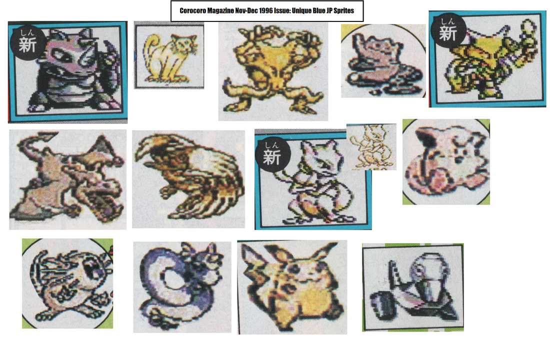 Some of these sprites are simply unrefined versions of the final;
Rhydon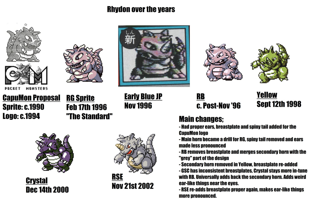 Rhydon's Blue JP sprite is very unique, and serves as a bridge between Rhydon's Green and Blue designs. Many tout Rhydon as a Pokemon near-unchanged since its inception, but this couldn't be further from the truth: it's actually very inconsistent. I've attached a timeline above that sums up these inconsistencies over time. There's more I haven't noted - including sprites - but at that point I'm really nitpicking. I'm not sure if Yellow truly removed the secondary horn as a part at the top of the head looks like it, but in that case, it was moved to god-knows-where...the perspective is really weird. Curiously, the Rhydon sprite from our little magazine has a breastplate akin to Yellow's, rather than RG's, though the eyes and secondary horn are clearly derived from the latter. On the flip side, the teeth are much like RB's. This is a very interesting intermittent design stage; you can look at this for ages and probably notice something else. Raticate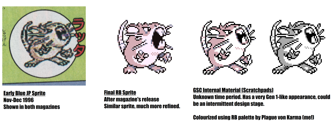 The Raticate sprite is quite clearly a less refined version of the RB sprite, but it's interesting for multiple reasons. It seems the Raticate sprite looked a bit smaller than the final, and the ears are drawn differently. Furthermore, the final Raticate sprite shrinks the middle whiskers, linking them with the upper row. But, there's an elephant in the room... There's a weird cowlick-like hair on its head, seemingly implying an unshaven appearance. This is shown on the GSC Scratchpad as well, only in a more pronounced fashion, implying that these designs are linked in some way. With this in mind, I believe that the Scratchpad Sprite is actually from the same time period as the early Blue JP one, considering that this design is never seen in any other material after the final game. It's not too difficult to make the assumption - the hands are near-identical among other uncanny design similarities - but that little hair really does it for me, at least. Alakazam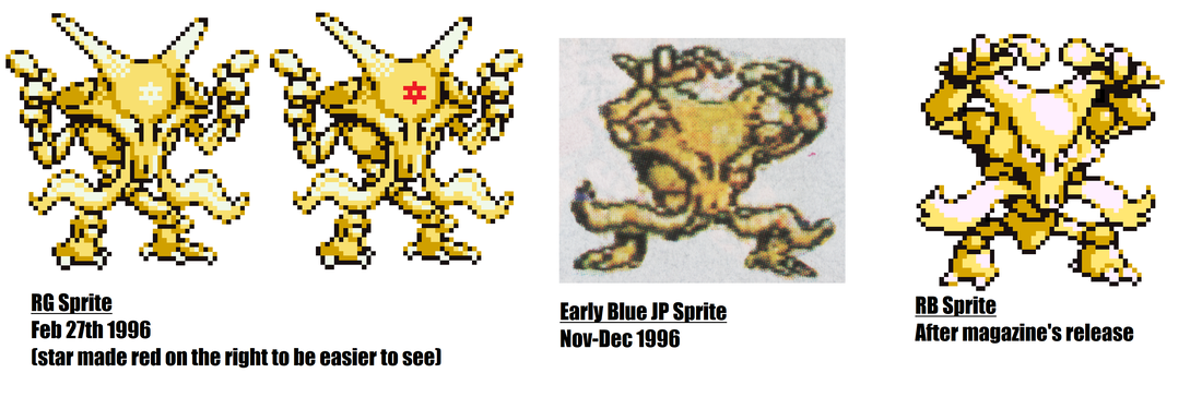 Alakazam's sprite has a bit of history tied to it, and it's a bit difficult to present efficiently. I apologize if it isn't coherent enough... In Red and Green, Alakazam had a star on its forehead, which some say looks like (or outright is) the Star of David, making it a point of contention. Anyway, that could be worth its own article when thinking about the Abra line's history of weird controversies. Alakazam had this star removed by the time Corocoro Magazine dropped its December 1996 issue. Some may draw parallels to Uri Geller's accusations of antisemitism and unauthorized use of his image, with him citing its depiction in the Pokemon TCG. However, that controversy only started in 1999, and as such, Uri Geller's intervention had no bearing on this design change, which makes it more plausible to assume this was an attempt to simplify Alakazam's already complex design. It's not uncommon to see Game Freak alter Pokemon designs and remove features that made them difficult for children to take in. This especially applied in the early days when there was just a small Game Boy screen and a limited amount of pixels. Another thing I find interesting here is how Alakazam's RG and early Blue JP sprites have very similar artstyles, while the final design is very different in that regard. Not only is it more refined, the eyes are drawn in a much more pronounced fashion and everything is much easier to take in. Furthermore, the feet lack claws, something that is featured in every other Alakazam interpretation to date. It is also the first Alakazam interpretation to feature two toes, which is something that's now commonplace for it. Overall, this a very good example of how Game Freak refines their designs during development, often with the intent to simplify it. ConclusionWhile I could go on about these sprites, the rest would be more nitpicky and just draw out the length of this article. Besides, I'm sure everyone else would love to scrutinize these sprites further and provide their perspectives. I'm very happy to own both magazines and seeing these sprites finally have scans that give them justice is a fantastic bonus.
Unlike MicroGroup Game Review Vol.14, I've not scanned the rest of the magazine due to its sheer size and lower-quality scans generally doing them justice anyway. I got the magazines to scan the sprites, and I think it's all that's necessary of me. Better-cropped sprites and more comprehensive reviews will be on The Cutting Room Floor, so keep your eyes peeled for that! I'm sure they'll do it better than my caveman-quality MS Paint diagrams, anyway. I also have a friend looking to recreate the sprites as well, since you can make out the individual pixels perfectly, which should be very interesting. If that project is finished, I'll either update this article or write up a new one.
1 Comment
|

About meSo I really, really like researching Prototype Pokemon information. That's about it. I also do things on Smogon, I guess. Archives
January 2021
Categories
All
|
 RSS Feed
